bridge
A app that allows professionals to inspire young adults to find future career paths.
Partners: Jonathan Koo, Tonatiuh Esquivel

project brief
To design a digital product that enables and/or empowers giving. How might we help those that are not normally considered philanthropists become such?
opportunity found

our goal
To help connect inner city kids with professionals, and let the professionals share their experience with a larger number of people, to make a greater impact to the society.

personas


mind map
By doing a mind map, we are able to visualize past the functions and features and see everything direct and indirect from other systems and software to the people involved and their roles.

wireflow & wireframe

visual design exploration

early mood board
We put together a mood board with images that feel youthful and friendly instead of being too serious and educational to the teenagers.

top 6 visual design
After exploring a wide variety of style, we narrowed it down to top 6 styles.


survey
We received 70 total responses from teenagers ages 13-21 to find out which styles appeal to them the most.

Through survey, we learned that lighter and softer colors are more popular than vivid colors with strong contrast because they make the content easier to read.
top 2 direction
Visual Design 1:

Visual Design 2:

We did a second round of survey and got almost equal votes for both designs. We decided to move on with visual design 1 because the colors are more cheerful and optimistic, representing the bright future of the teenagers.
final moodboard
The mood we wanted to achieve was friendly, youthful, clean, fresh, soft and modern.

The blue and green are used as background colors in the app as they are cool and more subtle. While the coral is used as a highlight color to make things pop.
visual style
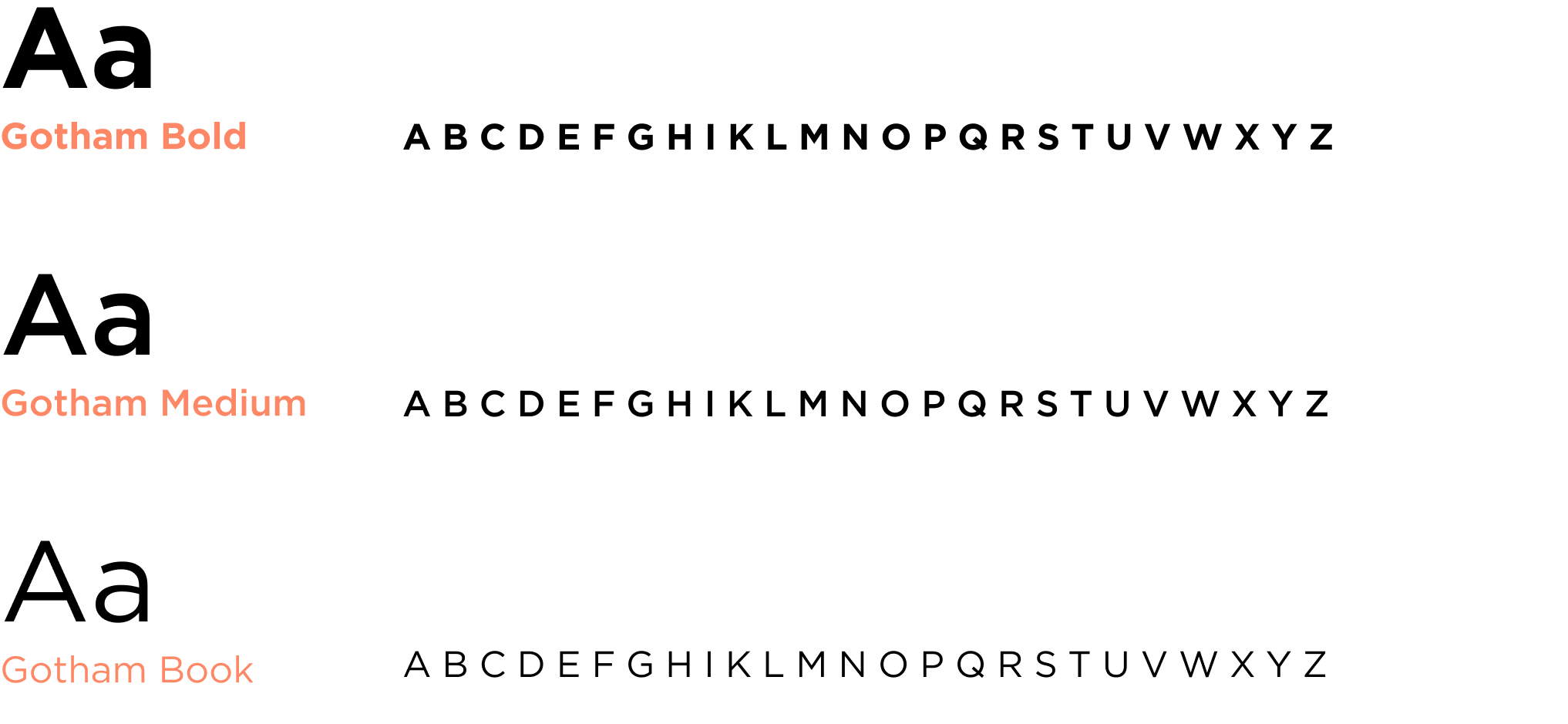
Typography:
Colors:

Icons:

bridge
